At the beginning of 2022, a word game called Wordle swept the world overnight. Suddenly, everyone was engaged in the game. Even if you weren’t, you definitely have seen friends and family sharing their scores on social media like this:
Wordle 353 4/6
⬜🟨🟨⬜⬜
🟨🟨⬜⬜⬜
⬜🟩🟩⬜🟩
🟩🟩🟩🟩🟩
In this article, UX Connections is going to discuss the fad that Wordle started and analyze the game from a UX perspective.
Wordle and Its Derivatives
To begin with, Wordle is a word-guessing game created by Josh Wardle. Unlike most digital games nowadays, Wordle lives on the web. You won’t be able to find it in the App Store or Google Play as it is a web-based game, and it’s now moved under the domain of New York Times: https://www.nytimes.com/games/wordle/index.html.
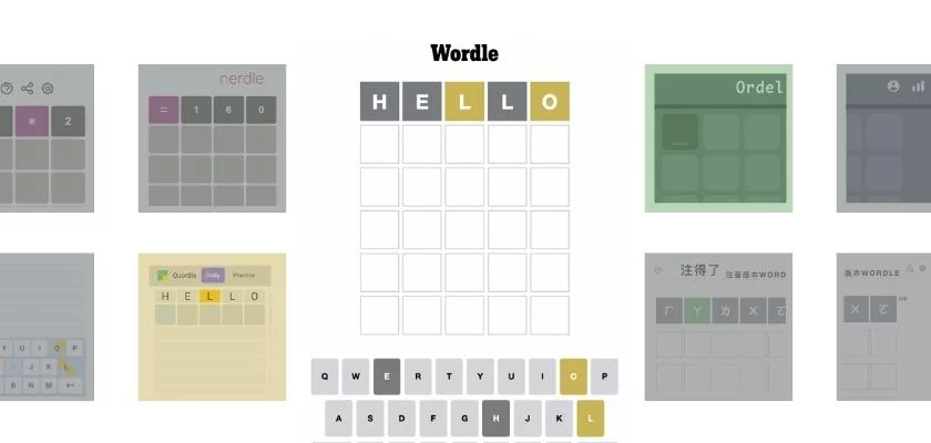
Every day, Wordle chooses a five-letter word, and all the players around the globe set out to find out which word it is, which is why overhearing a conversation about the word of the day might ruin your joy of cracking the code. Each player has 6 chances to get the word right.
After each shot, Wordle reveals the correct letters if they are involved in the word and if they are in the right positions. Yellow tiles indicate the former, and green tiles represent the latter. And that’s it, the game is as simple as it sounds!
A straightforward game as it is, Wordle became a craze. Players are obsessed with it and long for the new word every day. What’s more, they even create their versions of Wordle.
There are now at least 768 Wordle-like games available online in 149 languages. People take the patterns of the original Wordle and apply them to create new games, changing the languages or themes. The popular derivatives include:
- Nerdle (Wordle in mathematical equations)
- Quordle (Wordle x4, 9 guesses to solve 4 words at a time)
- Absurdle (Evil Wordle, changes the answer when players are about to get it right.
Besides, the language variations encompass not only those using Latin/Roman alphabets, such as the Swedish version Ordel, but also those using other language systems such as the Chinese version Bopomofo Wordle. There is no denying that Wordle has gone more than viral!
What Makes Wordle Addictive
Having learned the trend Wordle started, the very question UX Connections would like to address is what makes Wordle addictive (with a UX approach of course), especially when the creator has an intention to make it a non-addictive game.
They are using Nir Eyal and Ryan Hoover’s Hook Model since it is the perfect framework to guide the discussion.
Wordle’s success can be highly associated with its habit-forming influence on users. It is a product that leads players to build playing Wordle into their daily routines. One of the factors is that it satisfies the requirement of “triggers” when forming a habit.
Wordle managed to generate a great number of relationship triggers because it allows players to easily share their scores on social media. The content shared on social media serves as peer persuasion, and it is effective in triggering one’s action.
Besides, the effect can be further enhanced as Wordle acts as an answer to people’s internal triggers, such as boredom.
Second, it satisfies two important conditions for actions to take place – ability and motivation. Being a web-based game ensures Wordle’s accessibility.
Everyone has the ability to access the game as it requires neither registration nor download. The game can begin as soon as users arrive at the website.
The rules are straightforward too. They are explained in a pop-up within 10 lines. And Wordle has intuitive designs across the color choice, animation, and interface. It does not require a lot of thinking to interact with.
On the other hand, the joy of solving puzzles motivates people to continue, alongside the competition occurring in their communities.
It gives players a sense of achievement when they use fewer guesses than their friends. Releasing only one word a day also creates motivation as scarcity drives people to participate. The game is deemed valuable and worth playing.
The fixed frequency of one game per day is conducive to players’ habit development. But another thing that Wordle does well is showing a statistic page after each game. By disclosing the winning percentage, streak, guess distribution et cetera, Wordle implies to players how much effort they have made and that it is a shame if they quit.
This successfully prompts players to continue the game since they are aware of the time and effort they have invested. A streak of 10 or 20 wins is too good to let go.
What Could Be Improved
However, Wordle is not perfect, at least not yet. Inclusivity is something always on UX designers’ minds, and this is an area that Wordle could have done better. The messages players copy and paste when sharing their scores include colored square emojis.
The emojis look great but they are not friendly to the text-to-speech function. This could cause problems for visually impaired users since they rely on text-to-speech when using smartphones. Likewise, the mechanism of word selection can be more inclusive.
The words that differ in American spellings and British spellings can cause confusion and affect players’ experience, for example, color and color, center and center.
The same hints might lead to various guesses as the words are spelled differently. There are also complaints about the selected words being too British and are thus unfriendly to players worldwide. One of the words being criticized is “bloke”.
It’s a common word in the UK meaning “man”, but people outside the country might be unfamiliar with it, and therefore failed the game.
Yet the good news is that Wordle is making improvements. For color-blind users, Wordle is offering High Contrast Mode, replacing yellow and green with blue and orange. All they have to do is go to Settings and turn it on, which can be done in two steps.
Color-blind users are able to enjoy the game as everyone else does, with no more struggle.
Review From UX Consultant
Wordle is a well-designed, simple app that has mastered a quick and easy onboarding, and addictive UX, evident by its rapid uptake across the globe. It draws upon a user’s innate competitiveness, leading them to share with friends, that in turn, reminds others to complete today’s Wordle.
This driving force is even more strength due to the 24-hour timer; a common feature used on the globally trending app, BeReal.
In terms of improvements, the UI of the keyboard goes against the common practice for English mobile keyboards, critically moving the enter button to the left side.
Confusingly, this is the opposite of Qwordles keyboard layout! Ultimately, this is probably leading to a lot of accidental submissions of words and frustrated users.
Ultimately, this simple app has been created with substantial UX design for its small role in people’s day-to-day lives and provides a regular endorphin hit for many on the morning commute.
Wordle has reignited people’s passion for word games. Although there are still some areas that could be improved, from a UX point of view, Josh has done it well. He didn’t set about building an addictive or demanding game, which might sound like the opposite of common practice.
But it is his intention to build a simple, enjoyable game for everyone that causes success!
Source of Article

