

Microsoft’s Power BI dashboards tell a story and reveal key insights and patterns that could otherwise be lost in data sheets, allowing organizations to make better, more informed and faster decisions. The good news is you don’t need to be an IT expert to create a Power BI dashboard.
SEE: Explore our list of the best business intelligence tools.
Dashboards can be built in Power BI from one or several reports by importing datasets or duplicating an existing dashboard. Unlike reports — which may have multiple pages — dashboards are a single-page canvas. These dashboards can be updated to show the latest data, but they cannot be filtered like reports, nor can they be edited.
Jump to:
What is a Power BI dashboard?
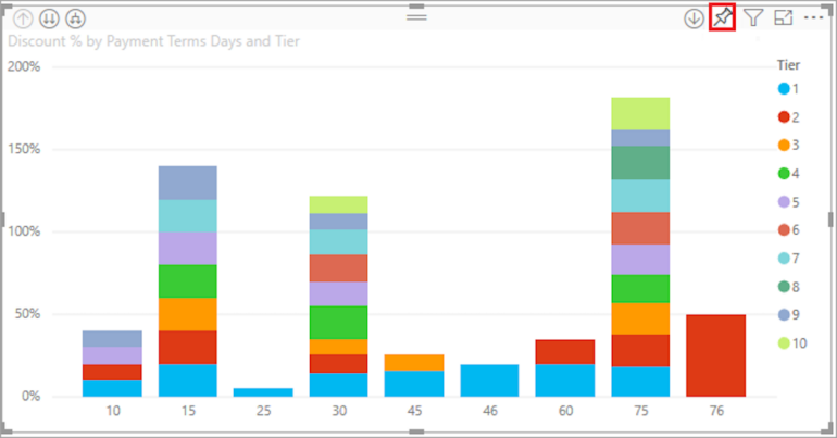
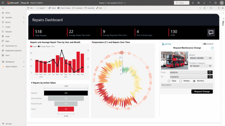
In Power BI, a dashboard, also known as a canvas, is a single page that presents the key metrics and data with high-impact visualizations (Figure A). Designing dashboards efficiently is critical as they are one of the main sources for data-driven decision-making.
Figure A

Power BI dashboards are used by executives, managers, team leaders, analytics and business leaders to track key performance indicators, drive decisions, communicate and present data, and work to meet business targets. As Power BI users advance, they can leverage more powerful features, for example using data analysis expressions.
SEE: Here’s how to calculate profit margin in Microsoft Power BI using a calculated column.
What to consider before creating a dashboard in Power BI
Before building a dashboard, you should think about what information you need to highlight. For example, a sales-focused organization may want its dashboard to include data on total sales, best-s products, sales over time, units by sale, sales by region and top segments.
Also, each organization should personalize its dashboard according to its goals, operations and efficiencies; there is no one-size-fits-all solution or approach.
Users should also understand that dashboards are a Power BI service, and they’re not available in Power BI Desktop.
How to create a dashboard from a report
If you don’t have your reports in Power BI, you can import your dataset as an Excel file.
Import Excel data to Power BI
- Open the Power BI service in your browser.
- From the navigation pane, select My Workspace, and then, click Get Data at the bottom of the menu.
- Under Files, select Get.
- Find your Excel file and click Connect.
- Select Import, and Power BI will automatically import the data.
Now that you have your report on Power BI, you can start building your dashboard.
Build a dashboard in Power BI
Dashboards are created by pinning tiles from a report to a new dashboard. It’s possible to pin an entire report to a dashboard or pin individual tiles from one or several reports. To do so:
- Select and open the Excel file report that will be part of the new dashboard.
- Select More options (…), then Edit to open the report in the Editing view.
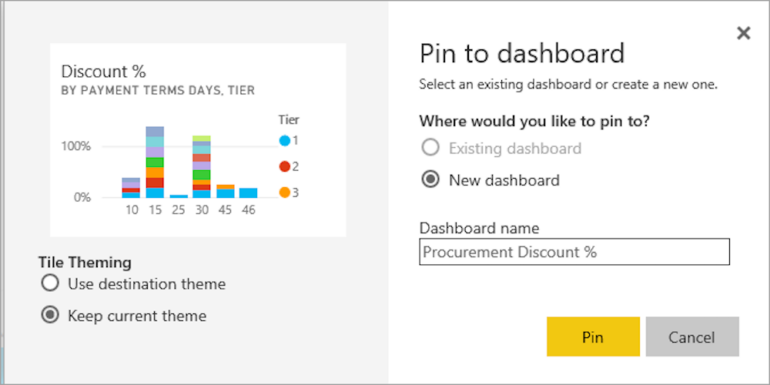
- Hover over a visualization. This will reveal the hidden options. Select the Pin icon to add the tile to the dashboard (Figure B).
Figure B
- Select New Dashboard, then name it (Figure C).
Figure C
- Click on Go To Dashboard.
The tile you pinned should now be the only visualization in your new dashboard. To pin more tiles, return to a report and repeat the process. Remember, when adding more tiles, click on Existing Dashboard and select the name of your new dashboard from the dropdown menu.
SEE: Now, learn how to create relationships in Power BI.
How to pin a tile from Excel to a Power BI dashboard
Alternatively, if you already have a dashboard set up in Power BI, you can borrow from Excel workbooks to emphasize key data points in your dashboard. To do that, you must first connect the Excel workbook you want to pin to your Power BI service. When a workbook is connected, a read-only version is saved, allowing you to pin ranges and entire worksheets to dashboards.
Connect an Excel workbook from OneDrive to Power BI
- Upload the workbook to your OneDrive.
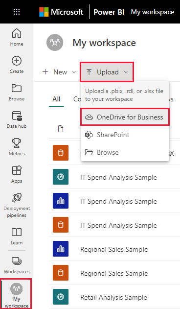
- Open Power BI and go to My Workspace, then Upload > OneDrive for Business (Figure D).
Figure D
- Next, search for your saved Excel file, select it and choose Upload.
- Now you should see the workbook added to Power BI in your workspace.
- Finally, open the workbook in Power BI by selecting the workbook you uploaded.
It’s important to remember that any changes you make to the workbook in Power BI don’t affect the original workbook file saved on OneDrive for Business.
Now that you have connected to a workbook, you can pin a range of cells to your dashboard.
Pin a range of cells or a table to a dashboard
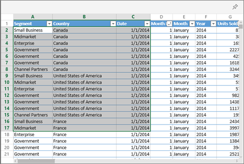
- Highlight the cells you want to pin to a dashboard (Figure E).
Figure E
You can even select a range of cells or an entire table or PivotTable. To pin a table, select the entire range and include the headers. To pin a PivotTable, be sure to include every visible part of the PivotTable, including filters if used.
- Select the pin icon.
- Pin the tile to an existing dashboard or to a new dashboard and confirm the operation by selecting Pin.
Once you have pinned the cells, you can edit the dashboard tile. Power BI can also connect with Microsoft Lists.
How to customize a dashboard in Power BI
Now that you’ve created your dashboard, you can personalize it in a variety of ways to ensure the information is presented in a way that suits you and your business’s needs.
How to edit and manage tiles in Power BI dashboard
Once the tiles are added to a Power BI dashboard, they can be easily modified and personalized. To resize tiles, the bottom right corner of the tile must be dragged, similar to resizing an image on a photo editor. The placement, appearance and behavior of titles can also be modified.
Change the title of the tile
- Select the More Options Menu (…) found in the upper-right corner of the title.
- Select Edit Details to open the Tile Details window.
- Change the title of the tile and add a subtitle if required.
In the same Tile Details window, users can change the behavior of the tile. Power BI sets the default behavior for each tile to direct users to the source report. However, that behavior can be changed to direct users to another dashboard, or report, by changing the default hyperlink in the Tile Details window.
Change the behavior of a tile
- In the Tile Details window, select Set Custom Link.
- Select Link and select where you want the tile to redirect users from the dropdown menu.
- Select Apply.
Dashboards are all about clear insight. Graphs, charts and other types of visualizations are key. There is a wide range of visualizations available on Power BI that can be combined to create a dashboard that not only looks good but drives performance and analysis.
Change the type of tile visualization
- Open the report that has the visualization you want to change.
- Select the visualization to make it active. Note that when the visualization is selected, it should show handles and a border.
- In the Visualizations pane, find and select the new type of visualization.
- Pin the Tile with the new visualization to your dashboard by clicking on the Pin icon.
Through the More Options menu (…), users can also add comments, copy the visual as an image, open in focus mode, export, view insights, delete the title and manage alerts.
SEE: Discover some of the best data visualization tools.
How to change the theme of a dashboard in Power BI
The theme of a dashboard can also be changed. Power BI has three themes to choose from: Light, Dark or Color-blind friendly. A dashboard’s theme can even be personalized by selecting the Custom theme option.
To change the theme, select the edit dropdown menu, then the Dashboard theme, choose the theme and click Save (Figure F).
Figure F
As endpoints become the new workplace, dashboards need to work efficiently across all devices including mobile. With Power BI, users can personalize a dashboard for mobile viewing.
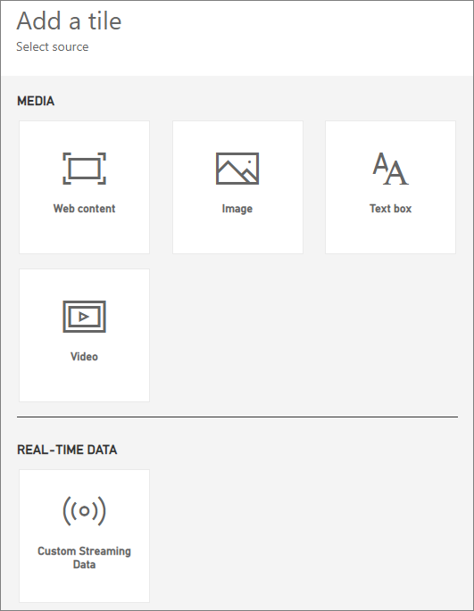
How to add images, videos and more to your dashboard
Power BI allows users to add a tile to a dashboard and place images, text boxes, videos, streaming data or web content in the tile.
To add an image or video to a tile:
- On the top menu, open the Edit menu (pencil icon) and then select Add a tile.
- Now select what type of tile you want to add. Options include web content, image, text box, video and custom streaming data (Figure G).
Figure G
- Before adding an image or a video you need to upload the file online, making sure security credentials aren’t required to access the file.
- In the Add tile window, click on Image or Video and then on Next.
- Now add the image or video, title, optional subtitle and URL of the image or video you uploaded. You can also create a hyperlink for the tile in this step (Figure H).
Figure H
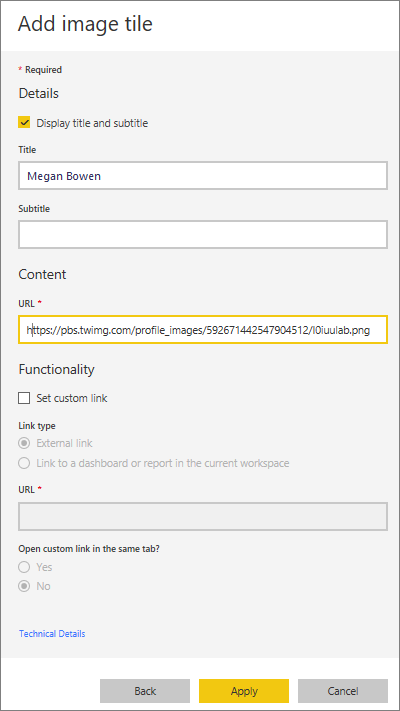
- Click on Apply.
- Finally, you can edit the tile, resize and move the content directly on the dashboard.
Users can follow the same steps to add text boxes, streaming data such as Twitter feeds or sensor data and web content via embedded code.
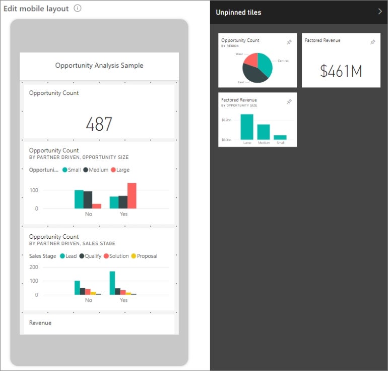
How to customize a dashboard for mobile view
First, select View, then click on Mobile Layout. Power BI will show you an emulated mobile version of the dashboard. Here, you can resize tiles, change information and move tiles. The mobile view can also be customized according to the different devices used to view the dashboard (Figure I).
Figure I
Power BI has several more advanced features for dashboards. From configuring real-time data to data classification or monitoring sales, each organization can make the most of its data by building its dashboard.
How to set alerts in Power BI
Alerts are a useful feature for Power BI dashboards. Each tile can manage alerts, and these can be available to anyone who has access to the dashboard. For example, a logistic manager may configure personalized alerts for each worker in different locations to make a supply chain run smoothly.
Alerts are sent to the Notification Center of Power BI, but users can also configure alerts to be sent to emails. To set alerts:
- Select the More Options menu (…).
- Click Manage Alerts.
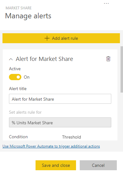
- Click Add Alert Rule. Make sure the Active switch is set to On (Figure J).
Figure J
- Set the threshold for the alert. Thresholds can be Above, Below or Specific.
- Set the frequency of the alert.
- Save and close.
How to create a QR code for a tile in Power BI to use in mobile apps
You can generate QR codes to seamlessly connect to data on a tile, creating a more interactive experience. QR codes can be created for tiles in any type of dashboard, even those where editing is prohibited.
QR codes can even be printed or emailed, but more commonly, they are scanned using smartphones. Users that scan the QR code will get instant access to the tile on their mobile device.
SEE: Here’s how to design and review reports for mobile devices in Power BI.
To create a QR code for a tile:
- Open any dashboard in your Power BI.
- Go to More Options (…) in the upper right corner of a tile and choose Open in focus mode.
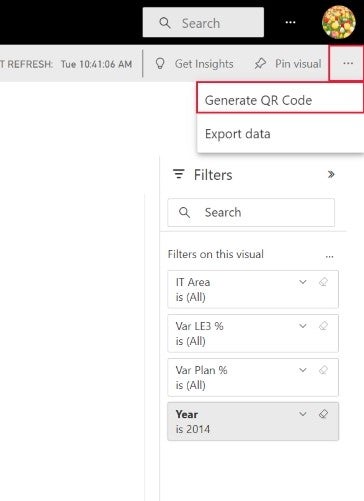
- Next, select More Options (…) at the top right and choose Generate QR Code (Figure K).
Figure K
- A dialog box with the QR code will appear (Figure L).
Figure L
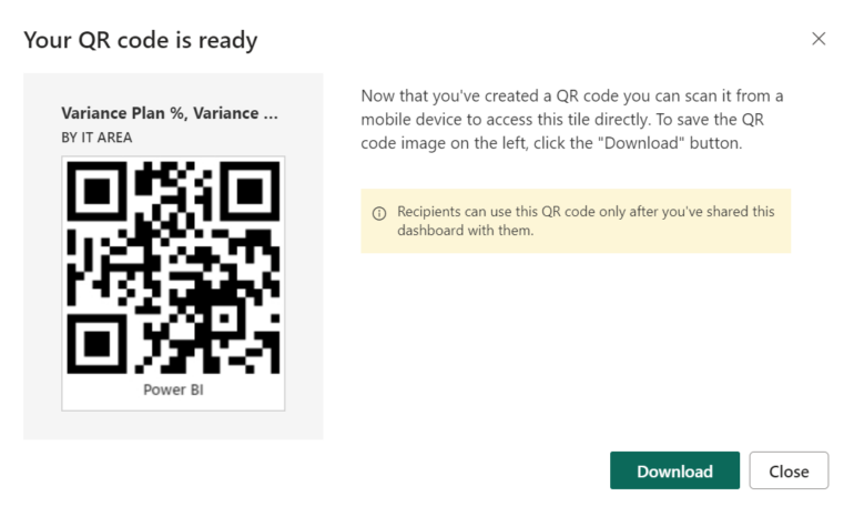
- Now you can scan the QR code, save it, or download it.
Source of Article