Setting up a simple data visualization dashboard in Tableau Software requires the application of data science and the artistry of display and presentation.

Image: lucadp, Getty Images/iStockphoto
In the modern business environment, data is constantly changing and updating. And while data visualization techniques can be used to transform raw data into useful, actionable information, that transformation often needs to be just as dynamic as the raw data feeding it. To accommodate and track changes over time, decision-makers often rely on data visualization dashboards.
Creating a dashboard in a data visualization application like Tableau Software could be as simple as clicking the “dashboard” button, but only if you have properly created your data visualization in the first place. This how-to tutorial shows you how to set up a simple data visualization dashboard in Tableau Software and explores some of the key elements involved in the process.
SEE: Feature comparison: Data analytics software and services (TechRepublic Premium)
Create a dashboard in Tableau
For this example, we will be using free sample data provided by the resources page of the Tableau Public website. Specifically, the Cat vs. Dog Popularity in the US dataset. You can download the dataset, in the form of an Excel worksheet, to any folder on your computer.
SEE: 56 Excel tips every user should master (TechRepublic)
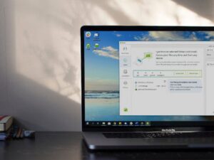
Open Tableau and connect to your dataset. You should see something like Figure A.
Figure A

Before you start building your worksheet and dashboard, take a look at the structure of your data. Take note of the columns and the rows—consider what data is contained in each. That data structure will inform many of the decisions you will make going forward.
In our example, state name is the variable breaking down our data on cats and dogs. It would seem natural that our dashboard users may want to compare one state’s cat and dog data with another state’s, so that is what we will create.
SEE: Hiring Kit: Market research analyst (TechRepublic Premium)
Click or tap the Sheet 1 tab to move to our first worksheet. As you can see in Figure B, there are several data points to consider in our dataset. For our dashboard, we are going to concentrate on household data. CTRL-click on Location, Cat Owning Households, and Dog Owning Households. That will highlight our data points, and Tableau will suggest data visualization possibilities in the Show Me section on the righthand side of the screen.
Figure B

We chose the bar chart so we could make a direct comparison between cats and dogs for each state. The Tableau application automatically took care of many of the settings necessary to set up our chart. If your first choice does not convey what you want to convey, you should try the other chart suggestions.
SEE: Tableau business analytics platform: A cheat sheet (free PDF download) (TechRepublic)
From the menu bar, find Dashboard and select new dashboard. Click and drag Sheet 1 to the display area to create our initial, rough draft, dashboard, as shown in Figure C.
Figure C

Users of our dashboard are not likely to want to see data from every state. It is more likely that they will want to view a single state or compare states. To fine tune the dashboard presentation, we will need to apply a filter.
Click the down caret on the side of our chart on the dashboard to reveal options. Select Filters | Location, as shown in Figure D.
Figure D

That will add a simple checkbox list of all the states, with all of the checkboxes filled in, like Figure E. But we can refine that even more.
Figure E

Right-click the filter we just inserted and select a different filter style from the context menu shown in Figure F. There are several choices, and which one you choose will be dependent on the nature of your data and the data visualization you are trying to convey. For our purposes, let’s choose the Multiple Values (dropdown).
Figure F

Now, a user viewing the dashboard can choose one state or several, making the presentation much more palatable. Notice, as you scroll over each bar on the dashboard (Figure G), details about what data that bar represents will be displayed.
Figure G

Of course, there is so much more that can be done to make our finished dashboard look more polished and professional. More details, better formatting, and purposeful color palate choices would help convey pertinent information to users. In many ways, data visualization specialists must apply both the hard science of data processing and the artistry of display and presentation.

Data, Analytics and AI Newsletter
Learn the latest news and best practices about data science, big data analytics, and artificial intelligence. Delivered Mondays
Also see
Source of Article