Learn how to create and customize a visual display of your data in Google Sheets or use the =SPARKLINE function to make a mini chart in a spreadsheet cell.

Illustration: Andy Wolber / TechRepublic
For many, a glance at a graph can convey meaning in a way that a look at a long list of numbers cannot. A well-constructed chart may make it possible for a viewer to comprehend a trend, compare quantities, or understand relationships in the data displayed.
As a collaborative, cloud-based app, Google Sheets lets you create charts collaboratively. You can work with other people each step of the way to enter data, select the cells to chart, experiment with different chart types, and refine the display to optimize chart readability.
SEE: Google Sheets: Tips and tricks (TechRepublic download)
For the greatest control over charts in Google Sheets, you’ll want to create and edit your charts with Google Sheets in Chrome on a laptop or desktop. Currently, the Google Sheets apps that you may install on Android or Apple devices offer a smaller number of charts (17, compared to 32 on the web), as well as far fewer chart display customizations than available in Google Sheets on the web.
How to create a graph in Google Sheets
To get started, go to Google Sheets in Chrome, then either open an existing sheet or type https://sheet.new/ to create a new spreadsheet. Then follow the steps below to create a chart with Google Sheets.
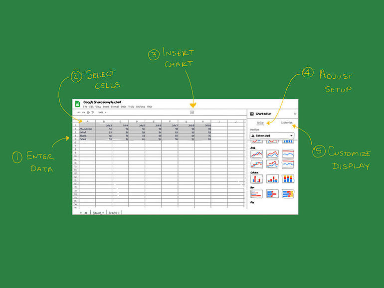
- Enter data. In most cases, you’ll enter data and labels in your spreadsheet in columns and rows. Typically, the furthest left column and uppermost row serve to label your data in some way. For example, if you use a spreadsheet to record sales, you might put store names in the cells along the left (e.g., column A) and place month names along the top (e.g., row 1). Double-check to make sure that the data you use for your chart is accurate.
- Select cells. Next, select the cells within your sheet that you want to use to create your chart. Often, you’ll first select a blank cell: The cell above your column labels and to the left of the rows. Once selected, drag your cursor to the lower-right boundary of your data cells. Alternatively, you may note the row and column address for each of these cells–the upper-left address and lower-right address–and proceed to the next step.
- Choose Insert | Chart. Either choose Insert | Chart from the menus (Figure A) or select the Insert Chart icon from the icons displayed above your spreadsheet. This creates a new chart in your Google Sheet. Unless you want to keep the chart on the same page as your source data, I recommend that you move the graph to a separate sheet. To do this, select the chart, then select the three vertically-arranged dots in the upper-right corner of the graph to access menu options and choose Move To Own Sheet. This adds the chart on a sheet you may select (along the lower-left area of your Google Sheet).
Figure A
” data-credit rel=”noopener noreferrer nofollow”>
After you have entered your data and selected the cells you want to chart, either select the Insert Chart icon or choose Insert | Chart.
4. Adjust Setup. To modify the appearance of a chart, select Edit Chart. If the chart is on the same sheet as data, select the chart, select the three vertically-arranged dots in the upper-right corner of the chart, then choose Edit Chart. The Chart editor sidebar displays to the right of your chart or sheet (Figure B). Within the sidebar, you may select either Setup, to modify chart data settings, or Customize, to adjust appearance.
Figure B
” data-credit rel=”noopener noreferrer nofollow”>
Select Edit Chart, then choose Setup to change the chart type (or adjust other chart settings), or Customize to modify chart appearance details.
Within Setup, the most significant selection you may make is the chart type. Sheets offers a wide variety of options that include several line, area, column, bar, pie, scatter, and map chart types, along with several other chart types (e.g., scorecard, radar, timeline, and candlestick options, among others). Sheets includes a table chart type, which displays the source data in a minimally formatted manner.
Select a chart type that accurately portrays the data–and the story about the data–you seek to convey. Broadly speaking, a line chart can show data changes over time, bar (horizontal) and column (vertical) charts let you compare quantities, and pie charts indicate portions of a total. If you’re unsure which type to choose, Berkeley Library at the University of California offers additional guidance.
5. Customize the display. The options available within the Customize section of the chart editor will vary with your selected chart type and setup settings. For example, with the table chart type, only a few options are available. In contrast, a line chart lets you adjust all sorts of style, title, series, axis, legend, and gridline settings. While the chart editor side panel is open, you may click on an element of your chart to select and modify the element settings.
While the default Google Sheet chart settings often create a readable chart, I encourage you to consider possible adjustments to your chart’s fonts, data labels, and colors. A slightly larger font size can help make chart text easier to read for many people. Enabling data labels, so that numbers display in your chart, can enhance the level of detail your chart provides. Adjusted colors may make your chart easier to understand for people who may not be able to distinguish the default color scheme well. You also might consider exploring PennState’s Charts & Accessibility tips.
Optional: Publish or Download. When complete, you might want to either publish or download your chart. Select the Publish Chart button while on the chart sheet to make your chart (or the entire sheet) available with a link on the web. Or choose Download Chart to save your chart as a PNG, PDF, or SVG file.
How to create a mini graph in a cell
Google Sheets includes the ability to make sparklines, a graph contained entirely within a cell (Figure C). Sparklines were first implemented in the modern era to indicate financial data for traders. That makes sense, since a sparkline may show a time series graph of a stock price, for example. You can create and display sparklines in Google Sheets on the web, as well as in the Google Sheets apps on Android and iOS.
Figure C
” data-credit rel=”noopener noreferrer nofollow”>
Add a sparkline (a mini graph in a cell) to your Google Sheet with the =SPARKLINE function. A sparkline may make data easier to interpret at a glance.
To create a sparkline, place your cursor in the cell you want the sparkline to display, then enter:
=SPARKLINE(
Next, click or tap and select a cell range, or type in a cell range. After you specify the range, enter a closing parenthesis. The function should display as something like:
=SPARKLINE(B2:I2)
The sparklines function also supports custom line settings, colors, and bar and column charts. See the Google Sheets sparkline function help page for more details.
What’s your experience with charts in Google Sheets?
When you create charts and graphs in Google Sheets, how much do you modify the settings from the defaults? Does your organization recommend specific chart settings in order to improve accessibility or comply with brand guidelines? If you use sparklines in Google Sheets, what types of information do these mini charts convey? Let me know how you use graphs, charts, or sparklines in Google Sheets, either in the comments below or via Twitter (@awolber).

Google Weekly Newsletter
Learn how to get the most out of Google Docs, Google Cloud Platform, Google Apps, Chrome OS, and all the other Google products used in business environments. Delivered Fridays
Also see
Source of Article