When you think about advertising agencies, their websites are often their first pitch – a stunning showcase of what they can do. Not only is a well-designed website desirable, but it’s essential to making an impression in this industry. It tells a story, engages potential clients, and must be spot-on creative.
That’s exactly what we’re diving into today. We’ve lined up a series of ad agency websites that really caught our eye. Each of these advertising agency websites serves as a perfect example of how strategic design and creativity can elevate a brand. Ready to see what sets them apart? Let’s take a closer look at these digital masterpieces and discover how they make their work in the world of advertising.
1. The Charles NY Agency

The Charles’ website is seriously sharp. The minute you land on their homepage, the sleek grayish background sets the tone for what’s to come: high-quality visuals and a clear understanding of what they do. Thanks to their thoughtfully organized top menu, navigation is very easy. Need to see their past work? Check out the portfolio. Curious about their company culture? There’s a whole section for that. This advertising agency even has a handy chatbox for quick questions and easy contact info.
But what really sets them apart is how they use video. Interactive videos showcasing client projects and their cool office space add a dynamic layer to the whole experience. And even with all these bells and whistle, the website loads super fast, so you don’t have to wait around.
It’s clear they didn’t just design a pretty website; they built it with user experience in mind. Everything’s easy to find and navigate. This focus on UX definitely puts The Charles ahead of the game when it comes to creating an engaging online presence.

This Toronto-based marketing agency website hits you with a bold first impression. The dark gray backdrop lets their visually stunning content take center stage. From the get-go, you’re greeted with interactive elements like photos and videos, making sure you’re hooked right away.
Now, the homepage might seem a tad intense at first glance with all that visual, but don’t worry. Navigation is as easy as it can be. A neatly tucked menu at the top right guides you effortlessly through all the different sections. And guess what? Even with all those dazzling visuals, the site loads lightning fast. The agency about us page takes a more relaxed approach, though. Clean and simple design with professional team photos and titles – it gives you a personal touch without feeling cluttered. Their portfolio is a masterpiece of simplicity too. Crisp white background, high quality project images, and short, clear summaries that get straight to the point. But, the “Insights” page throws a creative curveball. As you scroll down, the page splits in half, with the left side moving and the right side staying put, revealing the latest content. This innovative design trick not only grabs your attention, but it also makes browsing way more engaging. It’s a perfect example of how Massive Media blends creativity and functionality in their digital design.
3. The Miller Group Advertising Agency

Right from the start, The Miller Group’s website bursts with energy. Their homepage boasts a bright yellow background and a motivational slogan: “Be Unstoppable.” This bold color isn’t just eye-catching, they use it smartly throughout the site for call-to-actions and accents, creating a really cohesive look. The first thing you see is a showcase of their past projects and clients – all front and center, easy to browse. The fonts are big and clear, but they manage to keep the text under control so the website doesn’t feel cluttered. Instead, they let some cool visuals take center stage – think fun illustrations of people with animal heads and a squirrel on roller skates! It adds a playful touch to the overall professional vibe.
Their work page keeps it simple with projects neatly displayed in white boxes on a clean background. This straightforward layout makes it easy for potential clients to explore Miller Group’s past successes, highlighting their functionality without sacrificing that creative spark. US-based agency’s website is a great example of how online advertising companies can balance a professional look with a touch of personality.
4. DIJGTAL Agency
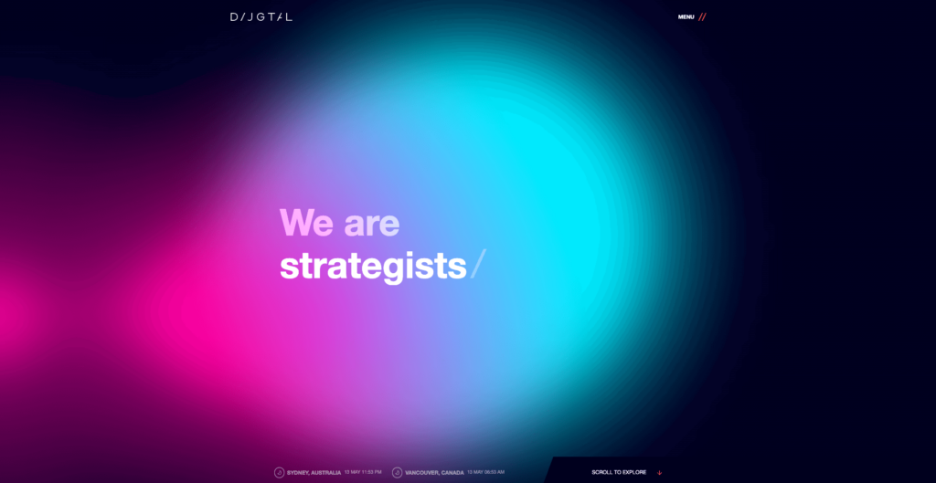
DIJGTAL’s website is a bold and dynamic mix of multimedia elements that grab your attention from the moment you click. The homepage starts things off with a dramatic dark background, but don’t worry, it’s not gloomy. They use splashes of bright, ever-changing colors to keep things interesting.
Instead of a wall of text, they let the design do the talking. Smooth scrolling and eye-catching images keep you glued to the screen. Then, the services page takes a sharp turn with a clean white background that puts the spotlight on each service they offer. This makes it super easy to read and understand what they do. Plus, there are these cool interactive dropdown menus that give you more details without feeling overwhelming.
Throughout the site, they sprinkle in unique design elements – colorful, animated infinity symbols and geometric shapes. It adds a layer of depth and intrigue without going overboard on the “busy” look. Overall, DIJGTAL‘s website is a creative example of how awesome design can transform a website. Every interaction feels like a cool discovery.
5. Aumcore Digital Agency
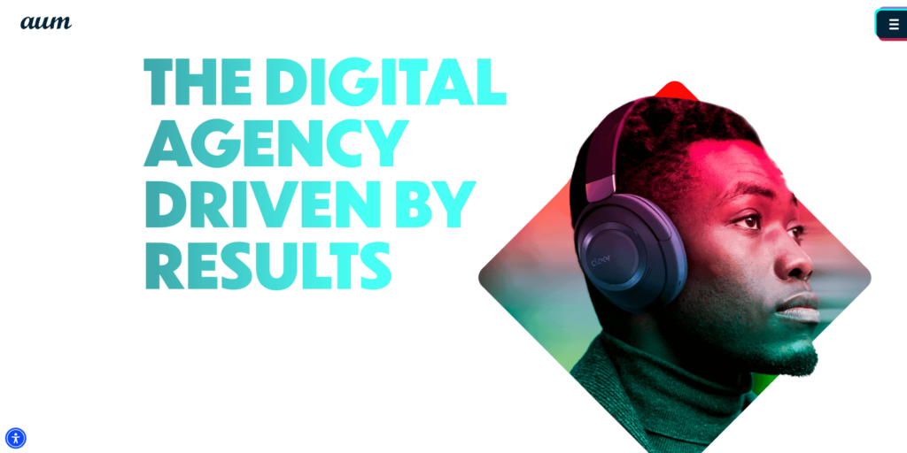
Advertising company Aumcore definitely took a unique approach with their website. It stands out with a clean and modern design, anchored by a crisp white background. But here’s the cool part: as you scroll, the website doesn’t just take you down the page. The elements on the screen actually transform and resize, creating a visually engaging journey through their content. It’s like a mini animation every time you scroll. Their projects are summarized really well, connected by a cool line that follows your scroll. It kind of shows how all their work is connected, which is a nice touch. They use a sophisticated navy color throughout the website, which keeps it looking professional and put-together.
The main menu is tucked neatly at the top right, with dropdown options for their services and work sections. This makes it super easy to navigate and explore their projects or specific services you might be interested in.
Overall, Aumcore’s website does a double duty: it showcases their digital skills and also offers a super creative user experience.
6. eMojo Advertising Agency
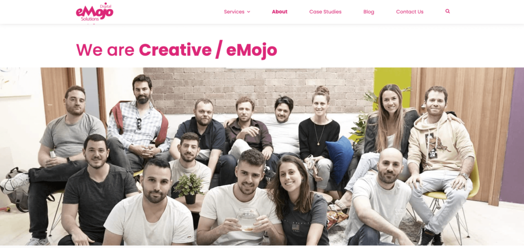
eMojo isn’t your typical advertising agency website. Forget flashy intros; they greet you with a down-to-earth video showcasing their cool team and workspace. It’s like getting a peek behind the curtain, setting a friendly tone for the entire site. Their website bursts with personality, much like their brand. Unlike minimalist competitors, eMojo isn’t afraid of color – a vibrant pink screams their name throughout the design.
But eMojo isn’t just about style; they prioritize substance too. They ditch the confusing animations for a user-friendly experience. Clear text, supported by eye-catching infographics, explains their services in a way anyone can understand. It’s a refreshing change.
And the best part is that they put their people front and center. Tons of team photos showcase the real faces behind the brand, fostering a sense of connection and trust. It’s like getting to know your neighbors before inviting them over – a brilliant way to build a memorable brand image.
7. Seed Performance Marketing Agency

Entering Seed’s website is like walking into a bright sunny day. Their homepage pops with a lively team shot that virtually bursts with excitement; forget about the typical business snoozefest. It’s a great first impression, setting the tone for a website that’s anything but boring.
The color scheme is like a carefully cultivated garden. Think cool, calming greens and blues, accented with pops of neon yellow, just like a sunflower reaching for the sky. This theme carries throughout the site, creating a cohesive look that’s instantly recognizable as Seed.
Unlike some flashy agencies with websites that resemble strobe lights, Seed embraces a clean and minimalist approach. Text is the star of the show, ensuring all the information you need is presented clearly and concisely. Finding what you’re looking for is a walk in the park – a neatly organized dropdown menu at the top right corner guides you through different sections, making navigation effortless. Seed’s projects are like blooming flowers – each one showcased in a beautiful square on a grid. Each square offers a quick glimpse of the project, and with a click, you’re whisked away to a dedicated page for a closer look.
They’ve also cultivated a content-rich blog, categorized by topic, where you can read their expertise on Google Ads, Google Analytics 4, and more. And to make things even easier, Seed strategically placed a “enquire now” button in the top right corner, like a ripe fruit ready for the picking – perfect for those ready to take the plunge and work with Seed.
8. The Brains Advertising Agency

UK-based the Brains stand out amongst other online advertising agencies with their website’s eye-catching color scheme. Think playful light purple paired with a vibrant turquoise – it definitely grabs your attention. The homepage delivers a clear message right off the bat. They list all their services prominently, with bold and appealing call-to-action buttons. Need help with SEO? PPC? They make it super easy to find the info you need and get inspired by their work. As you scroll down, you get a real sense of their experience. They showcase their diverse clientele, giving you a glimpse of the wide range of projects they tackle. It’s a long homepage, but they manage to pack it with info without feeling overwhelming. You’ll find everything from a breakdown of their services to some impressive case studies highlighting their past successes.
The site has a central menu at the top, but the cool part is their creative CTAs. Need a quick answer? Their phone number is right there. Interested in a free consultation? Click the button with the playful “Brain” illustration – it adds a nice personal touch. The website loads super fast too, which is always a plus. Additionally, their branding is consistent throughout the site, so you always know you’re dealing with The Brains.
9. War Room Inc Advertising Agency
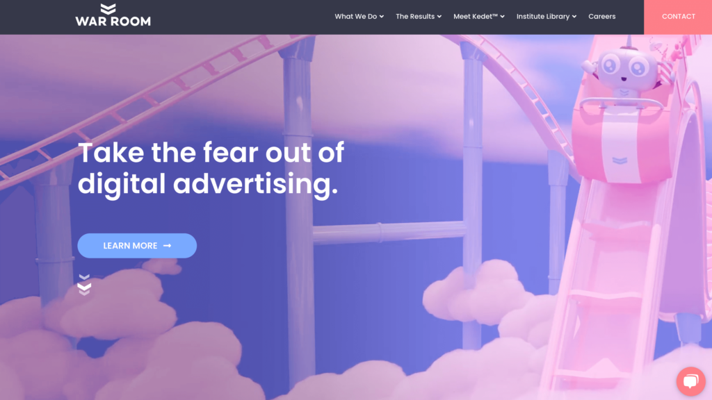
Forget static pages – this one explodes onto your screen with an animated intro that’ll grab your attention. It’s a visual feast, dominated by shades of pink, but don’t worry, it’s not all style over substance. They manage to balance the animations with clear and informative content, creating a perfect harmony. The illustrations aren’t just stock photos either! They’re unique and quirky, reflecting War Room Inc’s distinctive style and setting them apart from the typical agency website and make it rather creative. War Room Inc has a bright, contrasting contact button in the top right corner, so you can easily get in touch if you’re interested in working with them. But the real star of the show? Their mascot! They’ve cleverly integrated this playful character throughout the site, especially in the services and industries section. Imagine a fun “choose your adventure” type scene where the mascot is featured in different themed boxes, kind of like a Barbie doll package. One box might be styled for travel, with luggage and sunglasses, while another could represent healthcare with a syringe and stethoscope.
It’s a creative way to showcase their services on different industries, making the whole website feel like an interactive animation movie where the mascot is the guide. With its website, this USA agency War Room Inc. challenges other web design agencies, for sure.
10. Search + Gather Advertising Agency
The advertising agency Search & Gather throws a surprise with their website. They’ve skillfully combined a historical style with contemporary design elements to create a distinctive and inviting atmosphere, so forget about the conventional sleek and modern look. Right off the bat, you’re greeted by friendly faces – the team themselves. It sets a casual and approachable tone, letting you know they’re real people behind the brand. Their services are prominently displayed against a bright yellow background, each one with a clear call-to-action button that practically begs you to learn more. The website itself is clean and simple, with lots of white space that makes everything easy to navigate and understand. But don’t be fooled by the lack of clutter – they’ve cleverly added some creative user experience features to keep things engaging.
In the “Work” section, for example, they’ve listed their past projects in these cool squares that look like vintage Polaroids. It reinforces the vintage theme and adds a touch of nostalgia to the modern layout. It’s a clever way to blend old-school charm with contemporary design, making Search & Gather’s website not just visually cool but also a fun experience to explore.
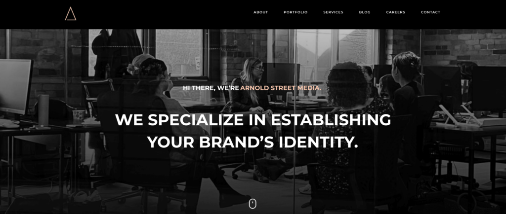
Arnold Street Media immediately makes a strong impression on you – their marketing agency logo isn’t the only thing that uses black and gold to make an impact. Their entire website is built around a striking black-heavy mixed with gold theme, creating a powerful and sophisticated look.
The homepage keeps things concise, but don’t mistake that for boring. They use a clean white background to make the space feel open and airy, drawing your attention right to the content they want you to see. The color scheme throughout the site is a sophisticated blend of black, white, and subtle powder tones. It adds a touch of softness to the overall design without losing its bold impact.
Their portfolio page is where things get interesting – forget walls of text. Arnold Street Media takes an unconventional approach, focusing solely on visuals. Imagine a beautifully arranged collage showcasing their projects. It’s a minimalist masterpiece that lets the creative work speak for itself, keeping things clean and clutter-free. While highlighting the advertising company’s creative skills, this design strategy also ensures a smooth and user friendly experience for anyone browsing the website.
12. InterTeam Advertising Agency
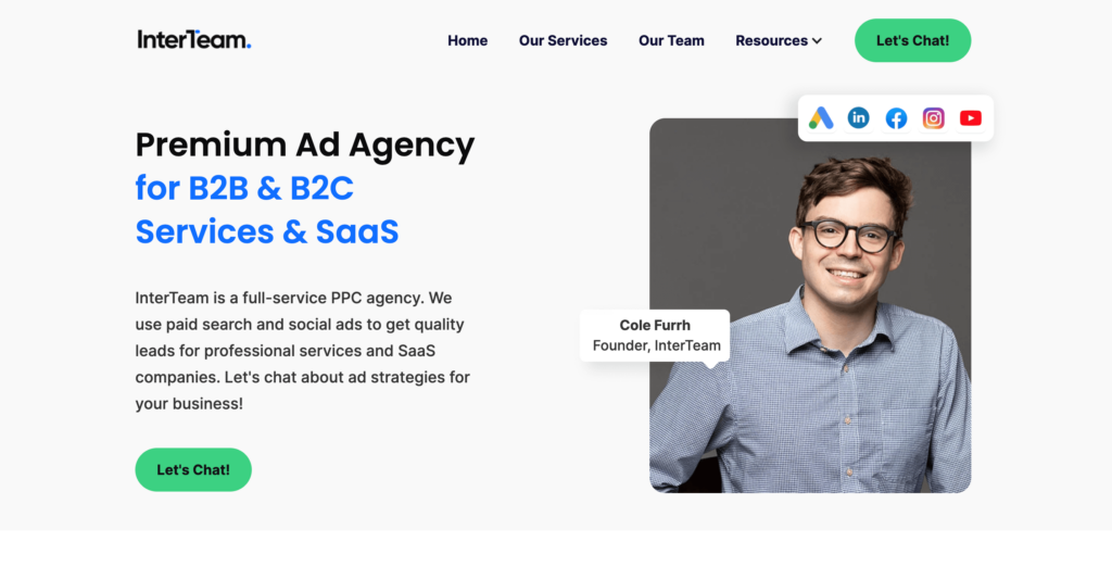
InterTeam’s website is all about simple lines and a user-friendly experience, so forget about fancy animations and crowded layouts. The interactive features of this advertising company website stand out against the clean white background, giving the entire site a visually appealing and captivating appearance. Plus, they use big, bold fonts everywhere, so you won’t have to squint to read anything.
As soon as you land on the homepage, you know exactly what InterTeam does. Their services are laid out beautifully, clear and concise. They don’t bombard you with a wall of text, but they manage to give you all the essential information you need to decide if they’re the right fit for you. It’s a perfect example of how less can be more – they prioritize giving you key insights while keeping the website sleek and uncluttered. Overall, InterTeam’s website is a winner in terms of simplicity and effectiveness. They prove you don’t need a fancy website to make a great impression.
Current Shifts in Advertising Agency Website Trends
Engaging Interactive Experiences
Modern advertising agency websites increasingly focus on interactive elements to captivate visitors. These include immersive animations, interactive storytelling, and dynamic content that changes based on user interaction. While enhancing user experience, this trend also displays the agency’s creative capabilities.
Emphasis on Accessibility and Inclusivity
Top ad agency websites are leading the charge in accessibility. There’s a significant push towards making websites accessible to all users, regardless of their abilities or disabilities. This includes following WCAG guidelines, offering text-to-speech options, and ensuring all visual content is compatible with screen readers. Through putting diversity first, organizations show that they care about a larger audience.
Advanced Data Visualization
To stand out in presenting complex information, many creative ad agency websites now employ advanced data visualization tools. While displaying data, these tools also enhance storytelling and provide clear insights into campaign performance. Interactive charts, graphs, and infographics are used to present data in a way that is easy to digest and visually appealing. This aids in both storytelling and campaign success illustration.
Integration of AI and Machine Learning
AI and machine learning are being integrated into websites to personalize user experiences. From chatbots that provide instant customer service to algorithms that adjust content based on user behavior, these technologies are setting new standards in how agency websites operate.
Wrapping Up
Each advertising company website we’ve listed today embodies the spirit of innovation that drives the industry forward. These websites prove that effective communication is about much more than just aesthetics. So, if you’re seeking inspiration, remember that the best advertising agency websites are those that dare to innovate while staying true to their core message.
Source of Article